

Content in this resource is still under active development and should be considered beta. It may change, move, antecede, or be deleted with or without notice.


Tests: Visual Readability Contrast
Introduction
ON THIS TAB
Summary
Visual readability of text requires good visual contrast. Visual contrast is a product of the text characteristics, such as font weight (thickness) and font size, the lightness/darkness difference of the colors used for the text and the background, and other factors.
Using objective guidelines and tools, evaluate font stroke width (weight), font size, background color, font color, and nearby colors and adjust the properties of those elements to achieve good visual contrast and readability.
Objective
This test method supports the objective:
How It Solves User Needs
All sighted users need adequate text size and weight, coupled with ample luminance contrast (the perceived lightness/darkness difference) between background and text colors, in order to read the text easily.
Following these guidelines will address many of the needs of users with low vision, color vision deficiency, and other visual impairments; certain cognitive and learning disabilities; and combinations of these. These guidelines address visual accessibility of digital content on desktops, laptops, tablets, and mobile devices.
Scope
This criterion addresses visual accessibility of lexical content displayed on desktops, laptops, tablets, and mobile devices.
Detailed Description
The visual contrast needed for easy reading of text is substantially higher than the contrast needed to simply "make out" words. At least ten times more contrast is needed for good readability than the bare minimum contrast needed for legibility.
Perception of contrast is affected not only by the lightness and darkness of the colors used for the text and background, but also by the weight (thickness) of the font, the font's size, and the relative spacing of lines and letters. Additionally, the perceived contrast can be different when the text is a darker color than the background, or vice versa.
A person's contrast sensitivity shifts throughout their lifetime, and visual impairments can cause a substantial reduction in contrast perception, requiring higher contrast text for the same readability. Some impairments can make it difficult to see certain hues, so it is important to ensure enough luminance contrast (lightness/darkness), and not to rely on color contrasts of hue and saturation.
Because a person's contrast perception is so variable, it is difficult for any one individual to judge what makes a good readable contrast for all. The solution is to use objective guidelines and tools to evaluate font stroke width (weight), font size, spacing & padding, and background & font colors to ensure good readability contrast.
Dependencies
- An APCA-W3 compliant perceptual contrast calculator
- A defined reference font family, for comparison purposes
- A target color space of a physical, self-illuminated display
Testing Criterion
ON THIS TAB
Conformance Minimums
The following minimum levels are used with the tests and methods to provide the basic pass/fail criteria for this objective.
Bronze Level Conformance
- GENERAL:
- Use case: all fluent content text
- No look up tables
- Exchange Rules: optional.
- Bronze Use Case Conformance Values for Testing:
- Body Text
- Minimum Contrast: Lc 75
- Preferred Contrast: Lc 90
- Other Content Text
- Fonts 16px or larger
- Minimum Contrast: Lc 60
- Large Fluent Content
- Fonts larger than 32px
- Minimum Contrast: Lc 45
- Maximum Contrast: Lc 90 (Large & Bold Only)
Silver Level Conformance
- GENERAL:
- Use cases: all fluent and sub-fluent content text
- Uses look up tables or tools for font weight & size
- Fonts for all body-text must be qualified, either prequalified or manually qualified using the Font Weight Test
- Exchange Rules: Must choose at least one.
- Silver Use Case Conformance Values for Testing
- Body Text & Fluent Content
- Per Lookup Table
- Minimum font size 14px
- Maximum Contrast for fonts larger than 36px: Lc 90
- Sub-Fluent & Logos
- Per Lookup Table
- Contrast Value can be reduced by as much as Lc 15
- But in no case can it be under Lc 40
- Minimum font size 10px
- Non-Fluent & Incidental
- Per Lookup Table
- Contrast Value can be reduced by as much as Lc 30
- But in no case can it be under Lc 30
Gold Level Conformance
- GENERAL:
- Use cases: all text (fluent, sub-fluent, non-fluent)
- Uses look up tables or tools for font weight & size
- Fonts for all fluent content must be qualified, either prequalified or manually qualified using the Font Weight Test
- Exchange Rules: Must choose at least two.
- Gold Use-Case Conformance Values for Testing
- Body Text & Fluent Content
- Per Lookup Table
- Except: When used for body text, any contrast value less than Lc 75 must be increased by at least Lc 15.
- Minimum font size 16px
- Maximum Contrast for fonts larger than 36px: Lc 90
- Sub-Fluent & Logos
- Per Lookup Table
- Contrast Value can be reduced by as much as Lc 15
- But in no case can it be under Lc 45
- Minimum font size 12px
- Non-Fluent & Incidental
- Per Lookup Table
- Contrast Value can be reduced by as much as Lc 20
- But in no case can it be under Lc 30
EXCHANGE RULES:
- Silver must choose one, Gold must choose two of these:
- Provides for more than one color scheme, at least light and dark mode, with control for user selection (persistent), and default of automatic following OS.
- Light mode body-text content using the Paper Reading Experience design guidelines.
- Provides a polyfill for proportional text zoom.
- Provides user controls for body-text weight, size, and spacing, persistent.
- Provides a set of hyper-legible fallback fonts, user activatable.
See Also: "Understanding Use Cases and Conformance Levels" for a more in depth discussion of conformance levels and use cases.
Font Lookup Tables
The following table cross indexes APCA contrast values to the reference font's CSS font-size and CSS font-weight.
Tables for Silver and Gold Conformance
- Reference fonts for comparison currently include Helvetica Neue, Helvetica, Barlow, and Arial.
- Contrast value must meet or exceed the value listed, using the absolute value for negative values (negative values represent light text on a darker background).
- A ⊘ indicates that a larger font size (or heavier font weight) must be used.
- A ®© indicates that the size and weight can only be used for non-content text (copyright, placeholder, disabled).
| Font Size |
Reference Font Weight | |||||||||
|---|---|---|---|---|---|---|---|---|---|---|
| 100 AVOID |
200 | 300 | 400 NORMAL |
500 | 600 | 700 BOLD |
800 | 900 | ||
| pt | px | APCA Contrast Value (Lc) | ||||||||
| 7.5 | 10 | ⊘ | ⊘ | ⊘ | ⊘ | ⊘ | ⊘ | ⊘ | ⊘ | ⊘ |
| 9 | 12 | ⊘ | ⊘ | ⊘ | ®© | ®© | ®© | ®© | ⊘ | ⊘ |
| 10.5 | 14 | ⊘ | ⊘ | ®© | 100 | 100 | 90 | 75 | ⊘ | ⊘ |
| 11.3 | 15 | ⊘ | ⊘ | ®© | 100 | 90 | 75 | 70 | ⊘ | ⊘ |
| 12 | 16 | ⊘ | ⊘ | ®© | 90 | 75 | 70 | 60 | 60 | ⊘ |
| 13.5 | 18 | ⊘ | ®© | 100 | 75 | 70 | 60 | 55 | 55 | 55 |
| 15.8 | 21 | ⊘ | ®© | 90 | 70 | 60 | 55 | 50 | 50 | 50 |
| 18 | 24 | ⊘ | ®© | 75 | 60 | 55 | 50 | 45 | 45 | 45 |
| 21 | 28 | ⊘ | 100 | 70 | 55 | 50 | 45 | 43 | 43 | 43 |
| 24 | 32 | ⊘ | 90 | 65 | 50 | 45 | 43 | 40 | 40 | 40 |
| 27 | 36 | ⊘ | 75 | 60 | 45 | 43 | 40 | 38 | 38 | 38 |
| 36 | 48 | 90 | 60 | 55 | 43 | 40 | 38 | 35 | 35 | 35 |
| 45 | 60 | 75 | 55 | 50 | 40 | 38 | 35 | 33 | 33 | 33 |
| 54 | 72 | 60 | 50 | 45 | 38 | 35 | 33 | 30 | 30 | 30 |
| 72 | 96 | 50 | 45 | 40 | 35 | 33 | 30 | 25 | 25 | 25 |
| Last Modified May 22, 2022 | ||||||||||
| APCA CONTRAST (Lc) |
Reference Font Weight | ||||||||
|---|---|---|---|---|---|---|---|---|---|
| 100 AVOID |
200 | 300 | 400 NORMAL |
500 | 600 | 700 BOLD |
800 | 900 | |
| Font Size in CSS px | |||||||||
| Lc 105 | 42 | 28 | 18 | 15 | 14 | 14 | 14 | 16 | 18 |
| Lc 100 | 42 | 28 | 18 | 15 | 14 | 14 | 14 | 16 | 18 |
| Lc 95 | 45 | 30 | 19.5 | 15.5 | 14.5 | 14 | 14 | 16 | 18 |
| Lc 90 | 48 | 32 | 21 | 16 | 15 | 14 | 14 | 16 | 18 |
| Lc 85 | 52 | 33 | 22 | 16.5 | 15.3 | 14.3 | 14 | 16 | 18 |
| Lc 80 | 56 | 34.5 | 23 | 17.3 | 15.6 | 14.6 | 14 | 16 | 18 |
| Lc 75 | 60 | 36 | 24 | 18 | 16 | 15 | 14 | 16 | 18 |
| Lc 70 | 64 | 40 | 28 | 19.5 | 18 | 16 | 15 | 16 | 18 |
| Lc 65 | 68 | 44 | 32 | 21.8 | 19 | 17 | 15.3 | 16 | 18 |
| Lc 60 | 72 | 48 | 36 | 24 | 21 | 18 | 16 | 16 | 18 |
| Lc 55 | 80 | 60 | 48 | 28 | 24 | 21 | 18 | 18 | 18 |
| Lc 50 | 96 | 72 | 60 | 32 | 28 | 24 | 21 | 21 | 21 |
| Lc 45 | 108 | 96 | 72 | 36 | 32 | 28 | 24 | 24 | 24 |
| Lc 40 | 120 | 108 | 96 | 60 | 48 | 36 | 32 | 32 | 32 |
| Lc 35 | NT | 120 | 108 | 96 | 72 | 60 | 48 | 48 | 48 |
| Lc 30 | NT | NT | 120 | 108 | 108 | 96 | 72 | 72 | 72 |
| Lc 25 | NT | NT | NT | 120 | 120 | 108 | 96 | 96 | 96 |
| Lc 20 | NT | NT | NT | NT | NT | NT | NT | NT | NT |
| Lc 15 | NT | NT | NT | NT | NT | NT | NT | NT | NT |
| Last Modified May 22, 2022 | |||||||||
Conformance
ON THIS TAB
Use Cases For Text
Understanding use cases and conformance levels, and how they work together to provide improved accessibility along with added design flexibility.
Text Use Cases: Body, Fluent, Sub-Fluent, Spot.
- FLUENT
- Fluent Readability, Block/Body Text
- Defined as: a block or column of more than two continuous lines of content text that uses a readable font with an x-height of ~19px or less.
- Fluent Readability, Primary content that is not body text
- Defined as: up to two and a half lines of continuous text.
- Includes headlines, captions, and images of text, if they contribute to content
- primary navigation and primary menus
- asides, tool-tips, spoilers, "continued"
- user entered text in forms, fields, etc
- does not include text the user controls or adjusts in size or color
- Defined as: up to two and a half lines of continuous text.
- Large Fluent header/title content
- Defined as: fluent subcategory of "large content" such as big, bold headlines, and generally referring to text larger than 36px.
- Fluent Readability, Block/Body Text
- SUB-FLUENT
- Soft Readability, sub-fluent secondary/ancillary content
- Defined as: non-primary content with relaxed readability needs.
- Applies to certain aspects of dataviz (call-outs, de-enhanced aspects of visual hierarchy)
- Category can include secondary/tertiary nav such as to TOS/EULA
- May include byline, short duplicative captions, footer matter.
- Defined as: non-primary content with relaxed readability needs.
- Soft Readability, sub-fluent secondary/ancillary content
- NON-FLUENT
- Minimum Legibility, non-fluent "non-content"
- Defined as: non-content text of an incidental nature.
- This category includes non-informative placeholder text, disabled controls, copyright/trademark/license bugs (but not actual license or legal text blocks)
- Defined as: non-content text of an incidental nature.
- Logo or Branding, brand related logo, symbol, service mark.
- This category relates to specific colors that are required as part of a brand or logotype.
- Incidental Text in Images text in images not critical to the understanding, nor specifically contributing to the content.
- Minimum Legibility, non-fluent "non-content"
Conformance Levels: Bronze, Silver, and Gold
BRONZE:
Covers primary content text only.- There is no font lookup table, only a set of general conformance levels.
- Use-cases for "body text" and "other content text".
- Spot text: disabled, placeholder, ancillary, decorative text is not covered
- Logos and incidental text in images are not covered
- There is no specified minimum font size.
- There is no requirement to match a reference font weight or size.
SILVER:
Covers all text content.- Font weight and size per Lc contrast value and font lookup table.
- Use-cases for "body text", "fluent text", "large fluent text", "sub-fluent text".
- Logos are covered, with a contrast requirement reduced by Lc 15.
- Spot text: disabled, placeholder, ancillary, decorative text are covered as a recommendation (should)
- The minimum font size for content is 13px, based on an x-height ratio of 0.5 (minimum x-height of 7.5px)
- Minimum font size for non-content text is 10px.
- Fonts used for body text (only) must be prequalified or compared to a reference font's weight or size, and appropriate offset used for equivalency.
GOLD:
Covers all text content, enhanced.- Font weight and size per Lc contrast value and font lookup tables per use cases.
- Use-cases for "body text", "fluent text", "large fluent text", "sub-fluent text", "non-fluent text" (Disabled, placeholder) and Logos.
- Ancillary, decorative text are covered with recommendations
- The minimum font size for content text is 18px, based on an x-height ratio of 0.5 (minimum x-height of 9px).
- Minimum font size for non-content text is 12px.
- Fonts used for fluent content text must be prequalified or compared to a reference font's weight or size, and appropriate offset used for equivalency.
EXCHANGE RULES:
Silver must choose one, Gold must choose two of following:- Provides for more than one color scheme, at least light and dark mode, with control for user selection (persistent), and default of automatic following OS.
- Light mode body-text content using the Paper Reading Experience design guidelines.
- Provides a polyfill for proportional text zoom.
- Provides user controls for body-text weight, size, and spacing, persistent.
- Provides a set of hyper-legible fallback fonts, user activatable.
Tests
ON THIS TAB
Objective, Procedural Testing
Measure the predicted contrast of the content to ensure it supports the required objective of adequate luminance contrast for readability.
Test Overview and Objective
- SCOPE: Determine the use-case category of the text (or non-text) element to be tested.
- SAMPLE: Obtain representative CSS color values for the foreground text (or non-text) element and the adjacent background
- CALCULATE: Using an APCA-W3 compliant contrast calculator determine the lightness contrast value (Lc).
- TEST: Check that the font size and weight is equal or larger than the minimum size and weight for the given use-case, as defined in the conformance guidelines.
Testing Step by Step
STEP ONE: Decide on the Conformance Level to Test For
With reference to the conformance levels and related use-cases as defined in this understanding section, choose one of the three conformance levels.
Test Procedure
- Determine the intended conformance scope, with a choice of Bronze, Silver, Gold
- BRONZE: Covers primary content text only.
- No font lookup table, only simple conformance levels.
- SILVER: Covers all text content.
- Font weight & size per Lc contrast value and font lookup table.
- Fonts for body text (only) are qualified with a weight/size offset for equivalency to the reference font.
- GOLD: Covers all text content, enhanced.
- Font weight & size per Lc contrast value and font tables per use cases.
- Fonts for fluent content text are qualified with a weight/size offset for equivalency to the reference font.
- BRONZE: Covers primary content text only.
STEP TWO: Determine the Use-Case(s) of Text to be Tested
A typical page of text content will have several different use cases of text, such as headlines, blocks of body text, text in menus, and so forth.
Depending on the chosen conformance level, it will not always be necessary to test every use-case of text. At a minimum, text the smallest, and also the lowest visible contrast examples on the page.
Test Procedure
- Determine the intended use-case-scope to be tested, per the conformance scope.
- Bronze Use Cases for Testing
- Body Text
- Other Content Text
- Large Fluent Content
- Silver or Gold Use Cases for Testing
- Body Text
- Fluent Content
- Large Fluent Content
- Logos & Branding
- Sub-Fluent
- Spot Readability
- Additional Gold Testing
- If the page uses non-standard fonts, then for gold level, additionally perform the separate font weight test.
- Bronze Use Cases for Testing
STEP THREE: Determine Colors and Contrast Value
This testing procedure provides guidance on how to determine the lightness contrast value (Lc) of the elements to be tested, such as the text against the adjacent background.
Test Procedure
- Obtain the CSS color values for the text (or non-text) element, and the adjacent background, using one or more of the color sampling techniques
- Using a contrast calculator that is compliant with the APCA-W3 contrast method, calculate the predicted lightness contrast (Lc value) between the foreground and background colors.
- Important: do not swap the foreground & background colors in the tool entry fields.
- The contrast evaluation is based in part on polarity, i.e. dark-mode or light-mode, so it is important that the background color value be entered into the background color field, and likewise for the foreground text or non-text element being tested.
STEP FOUR: Test and Evaluate the Contrast
Having completed the above steps, determine if the materials under test pass or fail the conformance guidelines.
- For automated tools, and calculators that provide a minimum size and weight with the results: Compare the smallest font size and weight as used in the content and use-case, and confirm that it meets or exceeds the calculated minimum font size & weight.
- For calculators that provide only a numeric contrast result, and require a manual comparison:
- Compare the calculated contrast value against the Conformance Minimums and for Silver of Gold, find the font and contrast value on the Font Lookup Tables.
- Check that the absolute value of contrast (the Lc value) meets or exceeds the required Lc value for the font weight & size, in the content of the given use case.
- Interpolation of the data in the font table is permitted.
- Remember that light text on a dark background generates a negative value; ignore the minus sign and use the absolute value when using the lookup table.
- Interpolation of the data in the font table is permitted.
Scoring the Result
In order to pass, either #1 or #2 must be true.
Conditional, Evaluative Testing
Determining Effective Font Weight
for Non-Standard Fonts
Because there is a lack of consistency in terms of weight and size among different font families this test method provides a means to equalize a font relative to a reference.
Matching a Design Font to a Reference Font
The APCA readability guidelines indicate font size and weight. These characteristics are related to a specific reference font such as Helvetica or Arial. In order to ensure that the chosen font for a design meets the same visual properties, it is necessary to do a side-by-side comparison.
Test Method Summary
Take your desired font and compare it to one of the reference fonts "Helvetica Neue, Helvetica, Fira Sans, Kanit, or Arial."
- Measure the x-height, and determine the relative size offset.
- Visually compare the weight And both a low contrast and high contrast setting, and determine the relative weight offset.
See this detailed step-by-step procedure.
Summary
Following a simple procedure, compare a desired design font to a reference font, and determine the Size and weight offsets needed for equivalence.
- Draft procedure discussed at the APCA forum on GitHub, and also in the draft APCA documentation.
Test Methods
ON THIS TAB
Visual Contrast Testing Techniques
These are specific techniques with examples, demonstrating best practices to support the tests for visual contrast of text and non-text elements.
Sampling Colors for Testing
These testing techniques provide guidance on how to determine the RGB color values of the elements to be tested, such as the color of the text and the adjacent background.
Color Sampling Techniques
Use one of the following methods, or an equivalent method that provides an accurate sRGB value (or RGB value in the relevant color space as displayed.)
- CALCULATED: Read the calculated values as determined by a browser, user agent, or automated tool.
- For consistency and ease of use, this is the preferred method.
- Ensure the values are for the sRGB color space. (Other spaces discussed separately).
- Ensure that colors with alpha channels (transparency) are fully composited, i.e. that the actual final color is sampled, with no remaining transparency.
- If the user agent or tool does not present the final color, it must be calculated.
- REFERENCE: Simple alpha compositing W3 CSS guidance regarding calculating colors involving alpha channels.
- AUDIT CSS: Auditing the CSS styles in use on the page.
- It is important to confirm that a particular style property is actually the active value.
- For complex style sheets, it is recommended to use the values as calculated by the browser, user agent, or automated tool.
- For colors with an alpha channel or transparency, calculate the final composited color using the method as described in Simple alpha compositing.
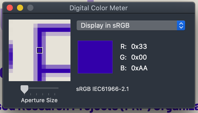
- EYEDROPPER: Sample the colors on the rendered page using a software based "digital color meter" eye-dropper type tool, which samples the rendered screen values.
- This method is required if testing content in an image, and also has the advantage of taking alpha blending into account without further calculations. Nevertheless, it is recommended to use the values as calculated by the browser, user agent, or automated tool as the preferred method for sampling colors.
- The eye dropper tool must report the native CSS value for the color space (nominally sRGB). See this guide for setting up an eye-dropper color meter tool properly.
- The eye dropper sample should be a pixel in the middle of a major stroke of the smallest size font to be tested, and with the content at the default size (no zoom or scaling).
- For small and thin fonts, where the major stroke is inconsistent due to antialiasing, sample at least three to five different letters and average the result.
Tool Setup
Setup for a Digital Color Meter (Eye Dropper)
In order for a digital color meter or eye dropper tool to provide useful color data, the system color profile and the tool need to be configured correctly. This tutorial is using the standard digital color meter app in MacOS.
The test system should use an sRGB monitor.
- Set the system color profile to a standard sRGB profile when using the digital color meter.
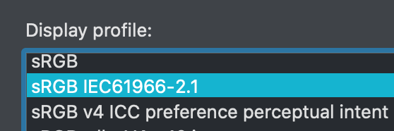
- Set the digital color meter to measure sRGB from the pop up menu.
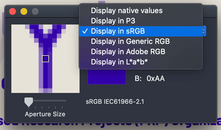
- Under the view menu, set the digital color meter to report the color values as decimal, hex, or percentage, per your working preference, or the needs of the other tools in use.
- Set the size of the sample to one pixel.
Qualify Font Size and Weight
Determining Effective Font Weight for Non-Standard Fonts
Test Method Summary
Take your desired font and compare it to one of the reference fonts "Helvetica Neue, Helvetica, Fira Sans, Kanit, or Arial."
- Measure the x-height, and determine the relative size offset.
- Visually compare the weight And both a low contrast and high contrast setting, and determine the relative weight offset.
Step by Step
I - Size
Part I.a - Setup
- Using a 400 normal weight font as the example, make a test webpage with two spans, each containing a single lowercase x, so they are next to each other horizontally.
- Set the font-family of one of the spans to the reference (i.e. Helvetica or Arial)
- Set the other span to the font being evaluated.
- Set the font-size to 100px. for both.
Part I.b - Measure
- Load the test page in a browser.
- Take a screen shot of both x as rendered.
- Load the screenshot into a photo editor and measure the height of each lowercase x.
Part I.c - Determine Offset
- Divide the x-height of the reference font, by the x-height of the test font.
- This value is the reference ratio.
Using the Reference Ratio
For a given minimum font size, indicated by the font look up table or APCA tool, multiply by the reference ratio to find the appropriate font size for the desired design font.
Part I Example:
This example compares the reference font Helvetica, to the desired design font Times New Roman.
▶︎ Click to see code
<!DOCTYPE html>
		<html>
		<head>

		<!-- Web Page Snippet 1: matching size to the reference -->
		<style>
		/* import test and reference fonts here, (not shown)
		or link them above in the <head> */

		body, section, div, p, span  {margin: 0em;padding:0;}

		.xheightMeasure{
			clear:both;
			padding: 24px;
			color: #222;
			background-color: #eaeaea;
			font-size: 100px;
			font-weight: 400;
			}

		.referenceFont {font-family: Arial, Helvetica, cursive,fantasy;}
		.testFont {font-family: 'Times New Roman', cursive,fantasy;}
		/* the reason the last font-family in the fallbacks is cursive Fantasy,
		 is to make it very clear that the desired font did not load as expected */

		</style>
		</head>
		<body>
		<!-- Measure the x-height compared to the reference font-->

		<div class="xheightMeasure">
			<span class="referenceFont">x</span><span class="testFont">x</span>
		</div>

		</body>
		</html>
(NOTE: this image was captured on a retina display, so the indicated sizes are twice what they would be on a standard display.)
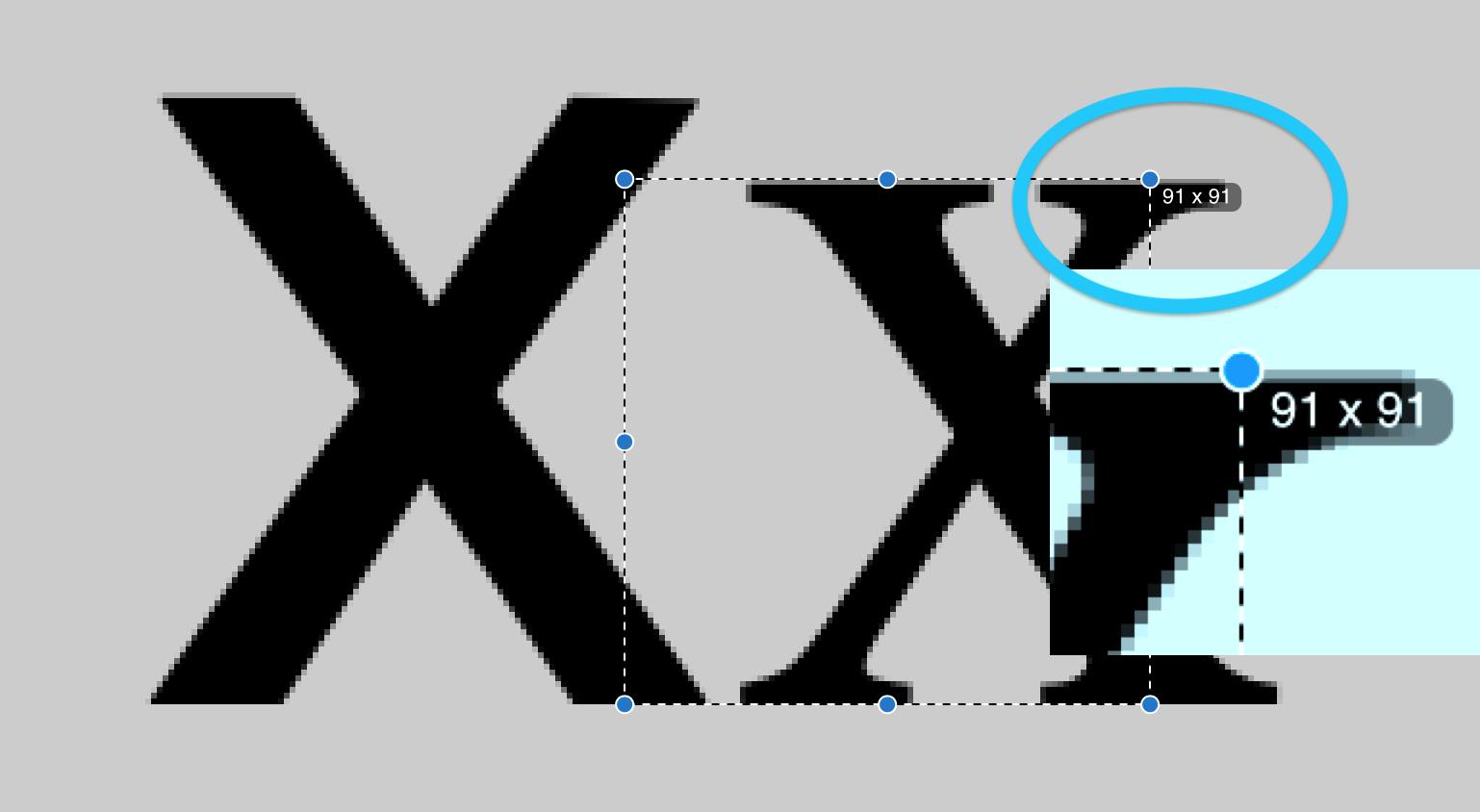
In this case 100px Helvetica would measure an x-height of about 52px. Determine the reference ratio by dividing the reference size by the font being tested. If the test font is 45px, such as this Times New Roman, then:
52/45 = 1.156
(round to at least two significant digits, three is shown here)
So for example, an APCA value of Lc 75 specifies and 18px reference font. To use the example of Times New Roman, multiply 18px by 1.156 to arrive at a minimum font size of 20.8px, or 21px rounded.
Why List Cursive?
Make the fallback font-family after the test and reference fonts something very different, such as "cursive". This way if the browser does not load the font properly, it is immediately obvious, as in this example:

II - Weight
While size per x-height is fairly straight forward, weight requires some visual judgment. There is active research into possible automated tools, but for the time being a visual reference is needed.
In this case, set up several lines of test text, with the test and reference fonts near the eventual size, as in the above example that's a reference size of 18px. The test font needs to be adjusted so that it has the same excite as the reference font as render to the screen.
In the example below, were using the common reference font Arial, at the standard normal and bold weights of 400 and 700. Arial is a clone of Helvetica, and either have very similar characteristics.
We'll make a few lines to compare different weights, and one with high contrast, and another set with very low contrast to help exacerbate the differences.
The test text is Il 400 &IcyATOMsizedgap, using an uppercase I & lowercase l as these make it easy to compare the vertical stroke widths. The sample text "& IcyATOMsizedgap" is short yet demonstrates most of the common design differences in a font.
Part II.a - Setup
- Setup a 400 normal weight, and 700 bold weight reference font as the comparison sample.
- suitable reference fonts are Helvetica or Arial.
- Make a test webpage with several lines comparing several weight examples of the test font to the 400 and 700 weight reference.
- The test font's size must be normalized so that the test and reference x Heights are equivalent.
- Create one test area for high contrast around Lc 90 and a second test area for low contrast around Lc 30.
- Use a consistent line of sample text for each line, and include the weight that is being tested for each line.
- An example is "
&IcyATOMsizedgap". - Include the weight that is being tested in each line.
- start and or end each line with a capital I and a lowercase l, to help make find comparisons of vertical stroke width.
- An example is "
Part II.b - Evaluate
- Evaluate each sample pair, and determine which test-font weight most closely resembles the reference font's weight.
- If thr test-font is in between two weights of the reference font, it is best to round up.
- If the test font is a variable font, as in the example below, find the variable weight that matches the reference.
Part I.c - Determine Offset
- Subtract the reference weight from the matching test font weight.
- This value is the reference weight offset.
- If there is a different reference weight offset among different reference weights, in-between weights may be interpolated.
Using the Reference Weight Offset
For a given indicated weight, add the reference weight offset to find the actual needed weight for the design font which was tested.
Weight Example
Below, a test setup for the "RALEWAY" Google font. Raleway has the same ex height as Ariel or Helvetica, so we can use the same size for both samples.
▶︎ Click to see code
<!DOCTYPE html>

<html>
<head>
<meta charset="utf-8">
<meta name="viewport" content="width=device-width, initial-scale=1">
<title>font test</title>

<link rel="preconnect" href="https://fonts.googleapis.com">
<link rel="preconnect" href="https://fonts.gstatic.com" crossorigin>
<!-- note that Raleway is a variable font that allows for the in-between
font weights shown. But be careful, incorrectly applying weights that
don't exist can cause the font import to fail. -->
<link href="https://fonts.googleapis.com/css2?family=Raleway:
wght@300;400;500;520;600;700;730;800&display=swap" rel="stylesheet">

<style>
body, section, div, p, span  {margin: 0em;padding:0;}

:root {
  --pad:18px;
  --spacer: calc((var(--pad) * 2) + 2px);
  }

.weightCompare {
  margin: 0em;
  padding: var(--pad);
  color: #ffc;
  background-color: #777;
  border: 2px solid #123;
  }

h2 {
  position:relative;
  margin: 0.5em auto;
  text-align:center;
  text-shadow: 0.12em 0.12em 0.18em #000;
  }

p.referenceFont {
  margin: 1em 0 0;
  font-family:Arial,Helvetica,cursive,fantasy;
  }
p.testFont {
  margin: -0.45em 0 0.25em;
  font-family:Raleway,cursive,fantasy;
  }

hr{margin: 1em;}

.hiCon {
  float: right;
  width: calc(50% - var(--spacer));
  padding: var(--pad);
  font-size: 18px;
  font-weight: 400;
  color: #222;
  background-color: #eaeaea;
  }
.loCon {
  float:left;
  text-align: right;
  width: calc(50% - var(--spacer));
  padding: var(--pad);
  font-size: 18px;
  font-weight: 400;
  color: #999;
  background-color: #d4d4d4;
  }

.clearFix {clear:both}

.weight3 {font-weight: 300;}
.weight4 {font-weight: 400;}
.weight5 {font-weight: 500;}
.weight6 {font-weight: 600;}
.weight7 {font-weight: 700;}
.weight8 {font-weight: 800;}

.weight52 {font-weight: 520;}
.weight73 {font-weight: 730;}

</style>
</head>

<!-- Web Page Snippet 2: Weighty Decisions -->
<body>

<section class="weightCompare">
<!-- find the closest matching weight to the reference font-->

<h2>Weight Comparison</h2>

  <div class="hiCon">

    <h3>Hi-Con Compare Lc 90</h3>

    <p class="referenceFont weight4">Il 400 & IcyATOMsizedgap Arial</p>
    <p class="testFont weight3">Il 300 & IcyATOMsizedgap Raleway</p>

    <p class="referenceFont weight4">Il 400 & IcyATOMsizedgap Arial</p>
    <p class="testFont weight4">Il 400 & IcyATOMsizedgap Raleway</p>

    <p class="referenceFont weight4">Il 400 & IcyATOMsizedgap Arial</p>
    <p class="testFont weight5">Il 500 & IcyATOMsizedgap Raleway</p>

    <p class="referenceFont weight4">Il 400 & IcyATOMsizedgap Arial</p>
    <p class="testFont weight52">Il 520 & IcyATOMsizedgap Raleway</p>

    <p class="referenceFont weight4">Il 400 & IcyATOMsizedgap Arial</p>
    <p class="testFont weight6">Il 600 & IcyATOMsizedgap Raleway</p>
<hr>
    <p class="referenceFont weight7">Il 700 & IcyATOMsizedgap Arial</p>
    <p class="testFont weight6">Il 600 & IcyATOMsizedgap Raleway</p>

    <p class="referenceFont weight7">Il 700 & IcyATOMsizedgap Arial</p>
    <p class="testFont weight7">Il 700 & IcyATOMsizedgap Raleway</p>

    <p class="referenceFont weight7">Il 700 & IcyATOMsizedgap Arial</p>
    <p class="testFont weight73">Il 730 & IcyATOMsizedgap Raleway</p>

    <p class="referenceFont weight7">Il 700 & IcyATOMsizedgap Arial</p>
    <p class="testFont weight8">Il 800 & IcyATOMsizedgap Raleway</p>

  </div>

  <div class="loCon">

    <h3>Lo-Con Compare Lc 30</h3>

    <p class="referenceFont weight4">400 & IcyATOMsizedgap Arial lI</p>
    <p class="testFont weight3">300 & IcyATOMsizedgap Raleway lI</p>

    <p class="referenceFont weight4">400 & IcyATOMsizedgap Arial lI</p>
    <p class="testFont weight4">400 & IcyATOMsizedgap Raleway lI</p>

    <p class="referenceFont weight4">400 & IcyATOMsizedgap Arial lI</p>
    <p class="testFont weight5">500 & IcyATOMsizedgap Raleway lI</p>

    <p class="referenceFont weight4">400 & IcyATOMsizedgap Arial lI</p>
    <p class="testFont weight52">520 & IcyATOMsizedgap Raleway lI</p>

    <p class="referenceFont weight4">400 & IcyATOMsizedgap Arial lI</p>
    <p class="testFont weight6">600 & IcyATOMsizedgap Raleway lI</p>
<hr>
    <p class="referenceFont weight7">700 & IcyATOMsizedgap Arial lI</p>
    <p class="testFont weight6">600 & IcyATOMsizedgap Raleway lI</p>

    <p class="referenceFont weight7">700 & IcyATOMsizedgap Arial lI</p>
    <p class="testFont weight7">700 & IcyATOMsizedgap Raleway lI</p>

    <p class="referenceFont weight7">700 & IcyATOMsizedgap Arial lI</p>
    <p class="testFont weight73">730 & IcyATOMsizedgap Raleway lI</p>

    <p class="referenceFont weight7">700 & IcyATOMsizedgap Arial lI</p>
    <p class="testFont weight8">800 & IcyATOMsizedgap Raleway lI</p>

  </div>

<div class="clearFix"> </div>

</section>

</body>
</html>
So here, find the closest visual match in terms of weight. If we look at a screenshot:

We see that Raleway is clearly lighter than Arial 400. Absent a variable font, we would say that Raleway 500 is close to Arial 400. As Raleway is available as a variable font, we can fine-tune, and determine that Raleway 520 is a close match to aerial 400. Therefore, the offset for a 400 weight font for Raleway is +120.
Raleway bold is also lighter than Arial 700, but here the difference is not as great. Using the variable, Raleway 730 matches Ariel 700, so the offset for Raleway is +30.
Here it is closeup:
Click for larger

A look to the lo-con version on the left helps to accentuate the weight differences.
Testing Conditions and Environment
Objective Test Baseline Setup
- Color samples are taken using the sRGB color space, the default color space for web content.
- The monitor used on the testing system is sRGB, and the system profile is set to sRGB
- Content to be tested is at the initial or default zoom for the given view.
- Content is using the embedded or page-provided CSS styles
- No user styles nor user-preference appearance altering extensions active
- For web based content, user agent shall be a commonly available browser capable of rendering the most recent recommended CSS and HTML standards, or an equivalent testing tool.
Color Spaces
Because sRGB is the default standard color space for web content, primary tests for conformance should be conducted in sRGB. It is permissible to conduct tests in other color spaces, so long as the primary tests for conformance are conducted in sRGB.
Modes
If a site or content is normally only presented in one mode, such as light mode or dark mode, then all testing must be conducted in that default mode, regardless of if it is light or dark mode.
If a site or content is available in multiple modes, then testing can be conducted in either light mode or dark mode, so long as the choice of mode is consistent through the group of visual testing. It is preferred to test all modes made available to the user, however, only one mode is required for testing.
Devices
If a site or content is optimized for one particularly type of device, then testing should be conducted with that target device. For instance a site designed for desktop should be tested using a desktop testing environment to test conformance.
If a site or content is responsive and therefore differs significantly between desktop and mobile, then the site should be tested in at least two scopes, ideally one of desktop, and one of small mobile. However, a site may specify testing in only one device scope for conformance purposes.
Conditional/Qualified Tests Standard Setup
Because conditional or qualified tests involve a certain amount of subjectivity, it's important to have a standardized environment for conducting any such tests. This is facilitated with a defined standard testing environment, intended to provide a consistent foundation for evaluations that require any degree of subjectivity.
The Standard Environment Shall Comprise
- A desktop sRGB LCD screen that is
- A non-retina, standard resolution display in the sRGB colorspace
- IPS or equivelent technology such that off-axis viewing is not impacted.
- For desktop, the monitor should have a ppi between 72 and 112 to allow an observer distance between 24" (60cm) and 37" (90cm)
- Monitor shall be calibrated using a hardware calibrator to:
- Max White (#FFF) Luminance between 140cd/m^2 and 220cd/m^2
- Black level (#000) target of less than 0.5 cd/m^2 or less.
- Preferred gamma target of 2.2.
- HDR displays are not included in this specification.
- Monitor's surrounding environmental conditions
- Background behind the monitor and within the users field of view should be neutral grey or white, at a luminance that is 20% of the monitor's maximum white.
- For instance if the peak white luminance of the screen is 140cd/m^2, that the immediate area surrounding the screen should be 28cd/m^2.
- Background behind the monitor and within the users field of view should be neutral grey or white, at a luminance that is 20% of the monitor's maximum white.
- Ambient light of approximately 350 lux.
- The light should not directly shine on the face of the monitor.
- The light should not shine into the eyes of the user while viewing the monitor.
The Standard Viewing Model Configuration Shall Comprise:
- Monitor positioned toward user in a way that minimizes reflections.
- Ambient evaluation procedure:
- Send the sRGB monitor full screen grey at sRGB value #7C7C7C.
- The average luminance of the area in view around the monitor should be the same as the monitor grey at #7C7C7C.
- The monitor at #FFFFFF should measure as a luminance five times higher than that measured at #7C7C7C.
- Standard observer positioning and desktop monitor resolution.
- Monitor resolution in ppi defines the observers view position.
- One CSS reference px is 1.278 minutes of arc or 0.0213°
- To determine the critical reading x-height in px for a given acuity, multiply the lower Snellen number by 0.47.
- For instance, for 20/40 vision, multiply 40 * 0.47 = 18.8px critical x-height.
- For a font like Helvetica with a 0.52 x-height ratio, this is a 36px font.
- As a quick rule of thumb: the font Verdana at 16px is approximately the critical size for standard 20/20 vision.
- Observer is positioned based on the monitor resolution.
- For a mobile device, the observer is positioned such that the 1px = 1.278' arc-min relationship is maintained.
- For a 96ppi monitor, the observer shall be 28" away.
| Screen Pitch vs Distance for 1.278 arc-min VA | ||||
|---|---|---|---|---|
| Distance to Display | Screen Pitch | Distance to Display | ||
| inches | ppi | ppcm | cm | |
| 244" | 11 | 4 | 621cm | |
| 122" | 22 | 9 | 310cm | |
| 96" | 28 | HDTV | 11 | 244cm |
| 37" | 72 | 28 | 95cm | |
| 28" | 96 | DESKTOP | 38 | 71cm |
| 24" | 112 | 44 | 61cm | |
| 21" | 128 | LAPTOP | 50 | 54cm |
| 18" | 150 | 59 | 45.5cm | |
| 17" | 160 | 64 | 42cm | |
| 16" | 170 | TABLET | 67 | 40cm |
| 15" | 180 | 71 | 38cm | |
| 14" | 192 | 76 | 35.6cm | |
| 13" | 204 | 80 | 33.5cm | |
| 12" | 224 | PHONE | 88 | 30cm |
| 10" | 268 | 106 | 25.5cm | |
| 8" | 336 | 132 | 20.3cm | |
| Screen Pixel Density @ various distances | ||||
| 1 pixel = 1 CSS ref px = 1.278 arc-min | ||||
| Some Values Rounded | ||||
Resources
ON THIS TAB
EMPIRICAL BASIS FOR THE GUIDELINES (IN PART):
Recited from the research of Lovie-Kitchin et alia.
| Reading rate (wpm) | Minimum acuity reserve |
|---|---|
| Spot (∼40 wpm) | 1.3:1 (0.1 log unit or 1 line*) |
| Fluent (≥100 wpm) | 2:1 (0.3 log units or 3 lines*) |
| Maximum | 3:1 to 8:1 (0.5 to 0.9 log units or 5–9 lines*) |
ARC body-text standards are based on the maximum rate with maximum contrast reserve, partly because it is assumed that body text is something that should be read at best fluent rate but also because body text is the most challenging because it is such a high spatial frequency—see the chart below.
Contrast Sensitivity vs Spatial Frequency
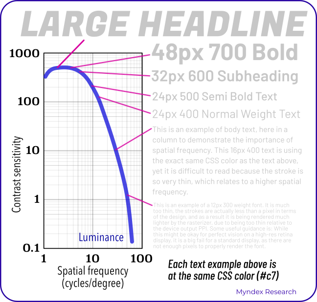
This chart shows the human contrast sensitivity curve, a horseshoe shaped curve where as items get smaller and thinner, contrast sensitivity very sharply drops off. This is particularly important for text.
This chart is adorned with sample text at various sizes, and all of the sample text is exactly the same gray color, but only the larger text is readable, while the smaller text is practically invisible.
The implication here is that it is the spatial frequency, in other words the size and weight of the text, that is most important, more so than the color. Contrast perception is much more about spatial than color at these higher spatial frequencies.
APCA Resources
- "Why APCA?". A plain language introduction to readability contrast.
- Accessible Perceptual Contrast Algorithm (APCA) Visual Contrast Calculator. Takes a pair of CSS sRGB colors and predicts the perceived contrast, suggests a minimum font size and weight for those colors.
- APCA on GitHub. The main repository for the source code and documentation for the APCA contrast method.
External Resources
- Color Vision Deficiency Simulator. Allows designers to preview how their designs may look like to individuals with color blindness. Includes an sRGB grayscale example, useful for visually assessing luminance contrast.
- Mac Color Meters & Color Space Conversion Regarding Digital Color Meters, i.e. "eye dropper tools" on Mac OS X.
- Please Stop Using Grey Text Myths regarding too much contrast are both overstated and misguided.
- Contrast Clearinghouse A catalog of white papers, reviews, articles, and technical information relating to color, contrast, and the APCA.
W3C Resources
- CSS Color Module Level 4 CSS color information, includes information regarding color spaces other than sRGB.
- sRGB Colors CSS specifications regarding the standard sRGB color space.
- Simple alpha compositing W3 CSS guidance regarding calculating colors involving alpha channels.
- Visual Contrast White Paper (In-Progress Draft) An overview of readability contrast, with infographics and a bibliography of the relevant peer reviewed science.
APCA Equation
This equation takes two sRGB color values, one for text and one for the background, and generates a perceptual lightness contrast value (Lc).
It is presented here as an svg image, in MathML, and with the original LaTeX code as the alt-text.
![{\displaystyle {\begin{aligned}\\\ \ \mathbf {APCA} \mathbf {\bullet W3} \ \ &\mathbf {\scriptstyle version\ {0.1.7}\ {developed\ for\ WCAG\ 3\ contrast\ guidelines}} \\[0.66ex]{\scriptstyle Using:}\quad \quad \quad \quad &\\\ \ {APCA}\ Contr&ast\ {Prediction\ Equation\ \ 0.0.98G-4g-base}\\\\Result:\ &{\begin{bmatrix}\hline {\scriptstyle Lightness\ Contrast}\\\quad L\!^{c}=\ S_{apc}\ {\boldsymbol {\times }}\ 100\quad \\\hline \end{bmatrix}}\\\\\textstyle Where:\quad &\\\hline {\scriptstyle Clamp\ Mi}&{\scriptstyle nimum\ Contrast\ Then\ Offset}\\[1.25ex]S_{apc}=&{\begin{cases}0.0\ \ &\vert C\vert <P_{out}\\C-W_{offset}\ \ &\ C\ >0\\C+W_{offset}\ \ &\ C\ <0\\\end{cases}}\\\hline {\scriptstyle Clamp\ No}&{\scriptstyle ise\ Then\ Scale}\\[1.25ex]C=&{\begin{cases}0.0\ \ &{\bigg \vert }Y_{bg}-Y_{txt}{\bigg \vert }<P_{in}\\S_{norm}\times R_{scale}\ \ &\ Y_{txt}<Y_{bg}\\S_{rev}\times R_{scale}\ \ &\ Y_{txt}>Y_{bg}\\\end{cases}}\\\hline {\textstyle Find\ }&{\textstyle Perceptual\ Lightness\ Difference}\\[0.75ex]&{\scriptstyle Normal\ Polarity\ (dark\ text/light\ bg)}\\S_{norm}=&\ Y_{bg}^{0.56}-Y_{txt}^{0.57}\quad \ _{Normal:\ Y_{bg}\ >\ Y_{txt}}\\[0.75ex]&{\scriptstyle Reverse\ Polarity\ (light\ text/dark\ bg)}\\S_{rev}=&\ Y_{bg}^{0.65}-Y_{txt}^{0.62}\quad \ _{Reverse:\ Y_{bg}\ <\ Y_{txt}}\\\hline {\scriptstyle Soft\ Clam}&{\scriptstyle p\ Black\ Levels}\\[1.25ex]Y_{txt}=&\ f_{clamp}(Y)\quad _{color\ of\ the\ text,\ symbol,\ or\ object.}^{where\ Y\ is\ derived\ from\ the}\\[1.1ex]Y_{bg}=&\ f_{clamp}(Y)\quad _{color\ used\ for\ the\ background.}^{where\ Y\ is\ derived\ from\ the}\\[0.66ex]f_{clamp}(Y_{c})=&{\begin{cases}Y_{c}\ \ &Y_{c}>=B_{thrsh}\\Y_{c}+{\big (}B_{thrsh}-Y_{c}{\big )}^{Bexp}&Y_{c}<B_{thrsh}\\\end{cases}}\\\hline {\scriptstyle Constants}&{\scriptstyle \ for\ Clamps\ and\ Scalers}\\[1.25ex]&{\begin{aligned}B_{exp}=&\ 1.414&R_{scale}=&\ 1.14\\B_{thresh}=&\ 0.022&W_{offset}=&\ 0.027\\P_{in}=&\ 0.0005&P_{out}=&\ 0.1\\\end{aligned}}\\\hline {\scriptstyle Estimate\ }&{\scriptstyle Screen\ Luminance}\\[1.25ex]\definecolor {DarkGreen}{rgb}{0,0.35,0}\definecolor {DarkRed}{rgb}{0.6,0,0}Y_s=\textstyle \sum &{\begin{cases}{\color {DarkRed}(\mathbf {R} ^{\prime }\div 255.0)^{2.4}\times 0.2126729}\\{\color {DarkGreen}(\mathbf {G} ^{\prime }\div 255.0)^{2.4}\times 0.7151522}\\{\color {Blue}(\mathbf {B} ^{\prime }\div 255.0)^{2.4}\times 0.0721750}\\\end{cases}}\\[1.25ex]{\{\color {DarkRed}R^{\prime },\color {DarkGreen}G^{\prime },\color {Blue}B^{\prime }\}}&\ {\in }\ \mathbf {s} RGB\\\hline \\\ GitHubRepo&\Rrightarrow \mathrm {https:\!//apcaw3.myndex.com} \\[0.75ex]\\\end{aligned}}}](./img/APCAw3_0.1.17_APCA0.0.98G.svg)
Selected Bibliography
Reading with low vision:
the impact of research on clinical management (2011)
Jan Lovie–Kitchin PhD
School of Optometry Queensland University of Technology
doi.org/10.1111/j.1444-0938.2010.00565.x
Luminance Contrast
Using Color In Information Display Graphics
Larry Arend, with contributions from Alex Logan and Galina Havin
NASA Website, NASA Ames Research Center, Human Systems Integration Division
https://colorusage.arc.nasa.gov/luminance_cont.php
Human factors design standard (HFDS) (2003)
Federal Aviation Administration (FAA)
HF-STD-001. Available for download at
An Engineering Model
for Color Differenceas a Function of Size
M.Stone, D.Szafir, and V.Setlur
Tableau Software, 2014CIC_48_Stone_v3
Comparing the Shape of
Contrast Sensitivity Functions for Normal and Low Vision
S.Chung and G.Legge
Vis Sci. 2016 Jan; 57(1): 198–207.
oi: 10.1167/iovs.15-18084 PMCID: PMC4727522
Psychophysics of Reading
(I, II, V, VI, XV, XVIII, XX )
G.Legge, D.Pelli, G.Rubin et alia
Vision Research, Vol. 25, No. 2, pp. 23-9252, 1985.
Vision Research, Vol. 27, No. 7, pp. 1165-1177, 1987
Vision Research, Vol. 29, No. 1, pp. 79-91, 1989
Investigative Ophthalmology and Visual Science,, Vol. 37, No. 8, pp. 1492-1501, 1996.
Vision Research, Vol. 38, No. 19, pp. 2949-2962, 1998.
Vision Research, Vol. 41, pp. 725-743, 2001.
Color Appearance Models
M.D. Fairchild
John Wiley and Sons, 3rd edition, 2013
Realities and Myths of Contrast and Color
A.M.Somers
Colorimetry: Understanding the CIE System
Janos Schanda, CIE
John Wiley & Sons, Inc. 2007
Does print size matter for reading?
A review of findings from vision science and typography
G.Legge, C.Bigelow
Journal of Vision (2011) 11(5):8, 1–22
Model for the spatial contrast sensitivity of the eye
P. Barten
SPIE Optical Engineering Press 1999
Computerized simulation of color appearance for dichromats
H.Brettel, F.Viénot, J.Mollon
0740-3232/97/1002647-09 1997 Optical Society of America