

Content in this resource is still under active development and should be considered beta. It may change, move, antecede, or be deleted with or without notice.


🔙 APCA Guidelines (Visual Contrast)

Design Guide: Visual Contrast
Provide sufficient contrast between foreground text and its background.
Get Started
ON THIS TAB
Summary
Sighted users need good visual contrast between foreground and background to read easily. Users with low vision need strong contrast between foreground and background to perceive content.
Why
All sighted users need a high enough level of visual contrast to distinguish elements from each other, and foreground from background. By visual contrast we mean the total perceived lightness/darkness difference between the text and the background. As text gets smaller and/or thinner, visual contrast may need to be increased to achieve the same readability.
EXAMPLE: you can increase perceived contrast by:
- Make the darkest of two colors darker
- Make the lightest of two colors lighter
- Increase the font weight (make it bolder, but letter spacing may need to be increased)
- Increase the font size (make it larger, but avoid letter spacing that is too tight)
- Use a different font design with intrinsically better contrast relative to the same x-size.
The use of color (hue/saturation) can help communication, but is does not replace the need for luminance (lightness) contrast, which is what is required for readability. When using color it should align with the purpose of the content. Too many colors with no purpose can cause confusion. Using hue and saturation to help group related content can be useful. Certain color pairs should be avoided.
Some users find too much contrast in large/bold elements may be distracting or overwhelming due to glare or neurological issues.
This guidance focuses on the needs of all users as well as users with low vision or visual/neurological impairments, and including CVD (Color Vision Deficiency, sometimes referred to as color-blindness or color insensitive vision).
Who it helps
- All sighted people, including those with with color insensitive vision need adequate visual contrast to read and understand text and graphic elements.
- By Visual Contrast we mean the difference between perceived lightness and darkness.
- For instance, those with deficient red sensitivity (known as protanopia) see colors involving red as darker, so these color pairs require greater contrast than others to compensate.
- People with low or reduced vision (due to poor contrast sensitivity and/or visual acuity) need higher visual contrast for readability. This is particularly true for those over 40, and also young children.
- People with some cognitive, language, and learning disabilities may benefit from the use of color and lightness/darkness contrast that is less saturated, serving the purpose of the content such as grouping related items.
How
Authors need to balance font size, font stroke width, background color, font color, and nearby colors to achieve good visual contrast. Authors can use tools to evaluate elements that predict the needed visual contrast for a given font size and weight to achieve a presentation which meets these requirements.
To conform to readability contrast guidelines, use an APCA compliant contrast calculator. An APCA (Accessible Perceptual Contrast Algorithm) based tool allows authors to test a pair of colors and calculate a predicted contrast value. This defines the minimum useable font weight and size.
Plan
ON THIS TAB
Planning Responsibilities
- Because perceived contrast, and therefore readability, is tightly connected to font weight and font size. it is important to plan your CSS styles to provide predictable and consistent size and weight for the target display(s).
- This is particularly important for responsive designs that resize or reconfigure to different device resolutions.
- While designers are free to use any size units such as em, vw, calc(), etc., it is important for the calculated sizes as rendered meet or exceed the size values listed as px in the visual contrast chart.
- For non-standard fonts, compare the relative x height to the x height of a standard reference font, and adjust the font-size value for a match.
- The design of each font also plays a significant part in readability and perceived contrast. When planning, selected fonts should be compared against the
standardized
fonts in the visual contrast matrix. - The available useable colors to achieve readable visual contrast is largely constrained by font weight & font size. Alternately if a specific color palette is required, the color palette may limit the minimum font weight & size.
- The needs of font weight, size, and color extends to readable text content in images.
- The colorspace standard for web content is sRGB. Images with other profiles may give unpredictable results.
- Plan to get images early in the design process so they can be evaluated and adjusted if needed
- A suggested best practice is to use textless versions of images and CSS compositing techniques to apply dynamic text over the image.
Tips for Collaboration
The planning and design phases will often be very interactive, and it is important to maintain communication and understanding of the available range of colors, sizes, and weights early in the process to allow adjustments to meet design goals and client needs.
Planning for Each Stage
Consider early design wireframes
and the space allocated for various elements, and how this will affect the desired font size in the final design.
Determine early on if the site will be responsive, to dynamically adjust and work on all device sizes, or if it will use a mobile separate
paradigm. This choice will significantly affect font weight & size.
To simplify early planning, remember that smaller and thinner (light weight) fonts require greater contrast between the font color and the background. Conversely, a lower contrast can be used with larger and thicker fonts.
How to Get Started Early
- Still to be developed. We will include this in a future working draft.
How to Remediate
- Still to be developed. We will include this in a future working draft.
Design
ON THIS TAB
Design responsibilities
- Smaller, lighter weight fonts require higher contrast colors.
- The CSS properties
-webkit-font-smoothing:
or-moz-osx-font-smoothing
should be set to auto (default), and notantialiased
(webkit), and notgreyscale
(moz).- This is especially true for normal weight fonts less than 24px, and light fonts less than 48px.
- The
antialiased
mode in font smoothing is actually a blending that reduces perceived lightness contrast by Lc 30 or more. - If the faux
antialiasing
mode is to be used, take note that normal and thin fonts may need to have their CSS colors adjusted to increase contrast.
- Certain color combinations can be very problematic on a computer monitor or mobile device.
- Never rely on hue alone for differentiating details. Adequate luminance contrast is required.
- The green in a monitor makes up the vast majority of luminance (light), so it will usually be a significant part of the lighter colors.
- Pure blues should typically be the darkest of two colors
- To use blue as the lighter of two colors, green needs to be added, otherwise there will be insufficient contrast and poor readability.
- This is both due to the low contrast and due to the human eye seeing blue at a lower resolution than green and red.
- The nature of blue light causes it to focus at a different location on the retina than red, so a pure red and a pure blue may
shimmer
when next to each other. - In the example below: Left, pure red (#F00) and a pure blue (#00D). Right, an equal amount of blue was added to the background which removes all detail from the blue channel.
BG #F00 TEXT #00DBG #E0D TEXT #00D - For many people, reducing or avoiding details in the blue channel can prevent chromatic aberration or shimmer.
- Pure red (#F00) text on a pure black (#000) background is not useful for readability. While standard vision may see it if the font is large enough, some types of color insensitive vision will not.
- In the example below: Left, pure red (#F00) on black (#000). Right, a simulation of how a person with protanopia sees it.
STANDARD VISIONPROTANOPIC VISION
- Different font designs affect perceived contrast and readability.
- While different font families use weights such as 400 or 700, those are not standardized in terms of contrast.
- Different families also vary in terms of x-height, so a 16px font in one family may be smaller or larger than a 16px font in another.
- Other font design attributes also create inconsistent perceived contrast between families.
- It is useful to visually compare a font family against the standard fonts used in the visual contrast matrix and take note of the differences in size, weight and the perceived contrast.
- When placing text in a container with a significantly different background color than the overall page, it is typically necessary to add padding around the text, so the eye can
locally adapt
to the text and container background. - Line spacing and letter spacing (leading and tracking), line length, and effects such as transparency and shadow all have an effect on perceived contrast and readability.
- Increasing letter spacing and line spacing can reduce crowding and improve readability contrast.
- Readability is improved by limiting the number of characters per line of text to no more than 80 characters, with an ideal line length being between 45 and 65 characters.
- Generally speaking, blocks or columns of text should be set to the highest contrast colors, especially for thin fonts.
- Contrast can be reduced for big bold headlines to reduce glare.
Designer Tips
- Keep in mind that web content is displayed on a wide variety of display types, devices, and resolutions. It is important to test how content renders on different browsers and systems.
- If you normally work on a
retina
display it is particularly important to examine content on a normal display. - Different browsers and operating systems render content differently, especially features such as shadows and other effects.
- Don't rely on
developer mode, mobile emulation
in a desktop browser, verify with different actual devices.
- If you normally work on a
- The sRGB colorspace is the standard for web content, and the standard for accessibility. This should be the default colorspace, and any other colorspaces should be a selectable user option.
- Workspace is important. Variations in monitor calibration and ambient lighting will affect the final output. See the Develop Tab for details on workplace setup.
User Testing and Meaningful Involvement
The need for a beta period for testing designs with the input of end users cannot be understated. During planning, design, and development, familiarity with user interface controls may obscure elements that an end user finds non-intuitive. It is important to identify these stumbling blocks early in design.
In the context of visual contrast and readability, this includes features where the user can adjust color or theme, and where the user may want to adjust font size or line spacing on their end.
Develop
ON THIS TAB
Technical Responsibilities
- Still to be developed. We will include this in a future working draft.
Technical Tips
- Javascript, PHP, and other dynamic page scripts must maintain the proper contrast and weight and size ratios.
- Ensure Javascript and other dynamic page scripts allow text to be scaled in size without breaking content, so that:
- User can scale the smallest content text five times larger on a full sized desktop screen without breaking content nor requiring horizontal scrolling for any single text element or text block.
- User can scale the smallest content text two times larger on a mobile device without breaking content nor requiring horizontal scrolling for any single text element or text block.
- User can scale the smallest content text five times larger on a mobile device without breaking content but horizontal scrolling is permitted in this use case.
- For all of the above, larger text does not have to increase by the scale amount, provided it remains larger than the smaller text that is scaled up.
- Ensure CSS style sheets, and inline styles do not use artificial font smoothing, and smoothing remains at default or
auto.
- The sRGB colorspace is the standard for web content, and the standard for accessibility. This should be the default colorspace, and any other colorspaces should be a selectable user option.
- The designer's workspace is important. Variations in monitor calibration and ambient lighting will affect the final output, often in unexpected ways.
- Use a hardware calibrator such as an XRite Display, and use software to calibrate the monitor to the sRGB standard.
- The ambient room lighting should be about 20% of the brightness of the monitor at peak white. For a monitor with a peak white of 160 cd/m2, the ambient should be around 200 lux.
- Put another way, setting the full screen to sRGB mid grey color #808080, the monitor should appear around the same brightness as the
overall
room lighting. - The color temperature of the room lighting should be 5500K, ideally with a CRI over 90.
- Don't paint the walls 18% grey. Instead, paint the walls pure white and set the lighting level so the white walls approximate the monitor at #808080 grey.
- And finally, avoid bright colors within the field of vision when looking at the monitor, as nearby colors can affect how you perceive the monitor content.
Examples
ON THIS TAB
The examples over black or white are the font Montserrat at 16px normal (400 weight). CSS font-smoothing is at default (auto, i.e. off) for these examples.
Black Background
Notice that the pure blue over black is very difficult to read. To use blue as the brightest of two colors, green must be added.
#00f Lc -16 • This is maximum blue on black, but still only Lc 16 contrast and therefore very difficult to Read. ☆ ★ ☎
#f00 Lc -37 • This is full red on black, approximately Lc -37 contrast. Some types of color vision problems cause the red to be ~55% darker (on sRGB) thus pure red could never be against Black. ☆ ★ ☎
#0d0 Lc -69 • This is green on black at Lc -60 contrast. ☆ ★ ☎
#0bf Lc -60 • Add some green for a readable blue against black. ☆ ★ ☎
#f88 Lc -57 • Add green and blue for a readable red against black. ☆ ★ ☎
White Background
Similarly, full green is hard to read against white, this is because green makes up the majority of luminance, or lightness.
#0F0 Lc 17 • This is Maximum Green on White, giving only Lc 17 contrast and very difficult to Read. ☆ ★ ☎
#080 Lc 71 • Keep green to less than #080 for readability when green is up against white, here is Lc 71 against white. ☆ ★ ☎
#C00 Lc 76 • This is sRGB Red on White, Lc 76 contrast. Some color vision problems cause red to be ~55% darker on sRGB, so it is better against white than black. ☆ ★ ☎
#00F Lc 85 • Full Blue against white is Lc 85 contrast, because blue contributes an insignificant amount to luminance. ☆ ★ ☎
Color Vision Deficiency
In the image below the samples were processed to simulate different forms of color vision deficiency (sometimes referred to as "colorblind"). Standard vision is upper left, and then the two most common forms of CVD are upper right in lower right.
Notice how the luminance deficits are exacerbated for colors against black, but improved contrast for colors against white. This is the opposite of the calculations created by WCAG 2.x Both standard vision and color deficient vision require substantial luminance for readability, and low luminance colors become even lower luminance for some forms of CVD when they are paired against black.

An important takeaway here is that colors that are rich in green including cyan and yellow, should never be paired with white or very light colors. And at the other end, colors that are rich in red and/or blue, including purple, orange, and teal, should never be paired with black or very dark colors,
Spatial Frequency
The first examples here over yellow are very high color contrast, using blue #009 against the light yellow #fe9 background, giving a contrast of Lc 88 — yet despite the high color contrast, the very thin small fonts are hard to read.
This demonstrates that at high spatial frequencies, it is the spatial frequency, not the color, that is most important for contrast. The fonts here are all 18px, at 200 weight, 300 weight, 400 weight, and 500 weight.
Then an example of 18px 400 weight using a lower contrast color of #6ab, here that color is too light for even a normal-weight font at this size. Yet this color is fine for a large bold font (32px 700 weight).
200 • This is Blue #009 ultra thin (200) text (Lc 88). —|–|–|—
300 • This is Blue #009 very thin (300) text (Lc 88). —|–|–|—
400 • This is Blue #009 normal (400) text (Lc 88). —|–|–|—
500 • This is Blue #009 thicker (500) text (Lc 88). —|–|–|—
———————————————————————————————400 • #6ab (Lc 40) is too much light for small & normal text
700 • #6ab is okay for large bold text
Font Smoothing
This final example is black 18px, and shows the difference with font smoothing if supported by this browser. Font smoothing should never be used for a small & thin fonts. The colors here are #555 and #FAFAF8, which is a WCAG 2.x 7:1, or APCA Lc 82. This is a live example and renders differently with different browsers.
This is 200 weight thin text with font smoothing on. 200|&|~|
This is 200 weight thin text with font smoothing off. 200|&|~|
This is 300 weight thin text with font smoothing on. 300|&|~|
This is 300 weight thin text with font smoothing off. 300|&|~|
This is 400 weight thin text with font smoothing on. 400|&|~|
This is 400 weight thin text with font smoothing off. 400|&|~|
This is 500 weight thick text with font smoothing on. 500|&|~|
This is 500 weight thick text with font smoothing off. 500|&|~|
Font smoothing is okay for large bold text.
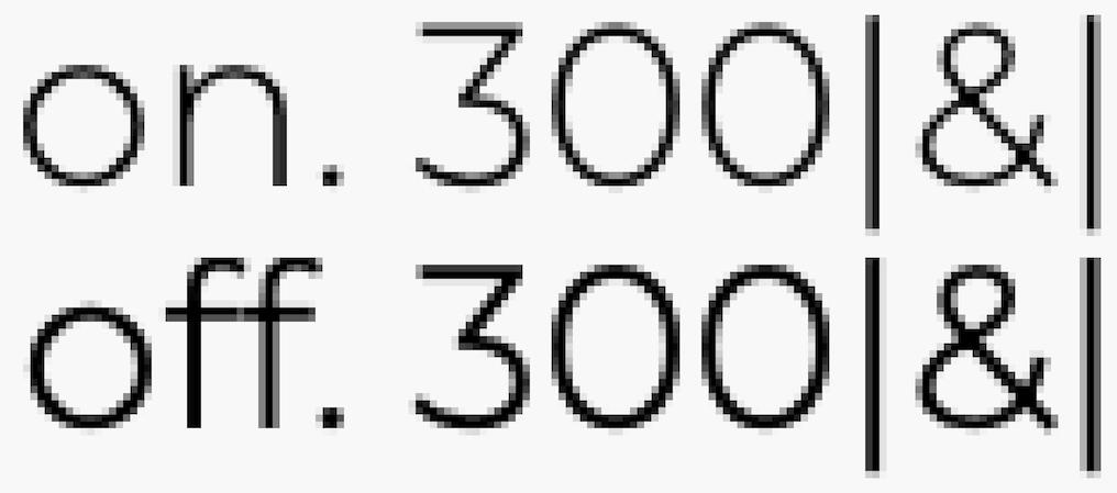
Below is a screenshot taking on a high resolution retina display, and despite that still shows the substantial reduction in contrast that is caused by excessive font smoothing.
Resources
- "Why APCA" A plain language introduction to readability contrast.
- APCA Tool A live web app that calculates readability contrast.
- Color Vision Deficiency Simulator A clinically accurate simulation of color insensitive vision.
- The Realities and Myths of Contrast and Color a comprehensive color article published at Smashing magazine.
- Introduction to Color and Accessibility A further tutorial on color and accessibility.
- Please Stop Using Grey Text Myths regarding too much contrast are both overstated and misguided.
- Contrast Clearinghouse A catalog of white papers, reviews, articles, and technical information relating to color, contrast, and the APCA.