

Content in this resource is still under active development and should be considered beta. It may change, move, antecede, or be deleted with or without notice.


Tests: Bronze Simple Mode
Introduction
ON THIS TAB
Summary
Visual readability of text requires good visual contrast. Visual contrast is a product of the text characteristics, such as font weight (thickness) and font size, the lightness/darkness difference of the colors used for the text and the background, and other factors.
Bronze Simple Mode is designed as a special introductory mode to using perceptually uniform contrast. It does not require the use of any mass or look up tables or matching to a reference font. Instead is designed as a simple set of threshold levels, similar to how WCAG 2 works, but using perceptually uniform math.
How It Solves User Needs
All sighted users need adequate text size and weight, coupled with ample luminance contrast (the perceived lightness/darkness difference) between background and text colors, in order to read the text easily.
Objective
This test method supports the objective:
Detailed Description
The visual contrast needed for easy reading of text is substantially higher than the contrast needed to simply "make out" words. At least ten times more contrast is needed for good readability than the bare minimum contrast needed for legibility.
Perception of contrast is affected not only by the lightness and darkness of the colors used for the text and background, but also by the weight (thickness) of the font, the font's size, and the relative spacing of lines and letters. Additionally, the perceived contrast can be different when the text is a darker color than the background, or vice versa.
A person's contrast sensitivity shifts throughout their lifetime, and visual impairments can cause a substantial reduction in contrast perception, requiring higher contrast text for the same readability. Some impairments can make it difficult to see certain hues, so it is important to ensure enough luminance contrast (lightness/darkness), and not to rely on color contrasts of hue and saturation.
Because a person's contrast perception is so variable, it is difficult for any one individual to judge what makes a good readable contrast for all. The solution is to use objective guidelines and tools to evaluate font stroke width (weight), font size, background and font colors to ensure good visual contrast and readability.
Dependencies
- An APCA-W3 compliant perceptual contrast calculator
- A defined reference font family, for comparison purposes
- The sRGB color space, the default color space for web content
Testing Criterion
ON THIS TAB
Conformance Minimums
The following minimum levels are used with the above test(s) to provide the basic pass/fail criteria.
Bronze Level Conformance
- Bronze Use Case Conformance Values for Testing
- Body Text
- Minimum Contrast: Lc 75
- Preferred Contrast: Lc 90
- Other Content Text
- Minimum Contrast: Lc 60
- Large Fluent Content
- Fonts larger than 36px
- Minimum Contrast: Lc 45
- Maximum Contrast: Lc 90 (Large Only)
Conformance
ON THIS TAB
Use Cases For Text
Understanding use cases and conformance levels, and how they work together to provide improved accessibility along with added design flexibility.
Text Use Cases: Body, Fluent, Sub-Fluent, Spot.
- FLUENT
- Fluent Readability, Block/Body Text
- Defined as: a block or column of more than two continuous lines of content text that uses a readable font with an x-height of ~19px or less.
- Fluent Readability, Primary content that is not body text
- Defined as: up to two and a half lines of continuous text.
- Includes headlines, captions, and images of text, if they contribute to content
- primary navigation and primary menus
- asides, tool-tips, spoilers, "continued"
- user entered text in forms, fields, etc
- does not include text the user controls or adjusts in size or color
- Defined as: up to two and a half lines of continuous text.
- Large Fluent header/title content
- Defined as: fluent subcategory of "large content" such as big, bold headlines, and generally referring to text larger than 36px.
- Fluent Readability, Block/Body Text
- SUB FLUENT
- Soft Readability, small sub-fluent secondary/ancillary content
- Defined as: non-primary content with relaxed readability needs.
- Applies to certain aspects of dataviz (call-outs, de-enhanced aspects of visual hierarchy)
- Category can include secondary/tertiary nav such as to TOS/EULA
- May include byline, short duplicative captions, footer matter.
- Defined as: non-primary content with relaxed readability needs.
- Spot Readability, sub-fluent "non-content"
- Defined as: non-content text of an incidental nature.
- This category includes non-informative placeholder text, disabled controls, copyright/trademark/license bugs (but not actual license or legal text blocks)
- Defined as: non-content text of an incidental nature.
- Logo or Branding, brand related logo, symbol, service mark.
- This category relates to specific colors that are required as part of a brand or logotype.
- Incidental Text in Images text in images not critical to the understanding, nor specifically contributing to the content.
- Soft Readability, small sub-fluent secondary/ancillary content
Conformance Level: Bronze Simple Mode
BRONZE:
Covers primary content text only.- There is no font lookup table, only a set of general conformance levels.
- Use-cases for "body text" and "other content text".
- Spot text: disabled, placeholder, ancillary, decorative text is not covered
- Logos and incidental text in images are not covered
- There is no specified minimum font size.
- There is no requirement to match a reference font weight or size.
Tests
ON THIS TAB
Objective, Procedural Testing
Measure the predicted contrast of the content to ensure it supports the required objective of adequate luminance contrast for readability.
Test Overview and Objective
- SCOPE: Determine the use-case category of the text (or non-text) element to be tested.
- SAMPLE: Obtain representative CSS color values for the foreground text (or non-text) element and the adjacent background
- CALCULATE: Using an APCA-W3 compliant contrast calculator determine the lightness contrast value (Lc).
- TEST: Check that the font size and weight is equal or larger than the minimum size and weight for the given use-case, as defined in the conformance guidelines.
Testing Step by Step
STEP ONE: Decide on the Conformance Level to Test For
With reference to the conformance levels and related use-cases as defined in this understanding section, choose one of the three conformance levels.
Test Procedure
- Determine the intended conformance scope. This page features the bronze simple mode, however the main test methods page provides a choice of Bronze, Silver, Gold
- BRONZE: Covers primary content text only.
- No font lookup table, only simple conformance levels.
- SILVER: Covers all text content.
- Font weight & size per Lc contrast value and font lookup table.
- GOLD: Covers all text content, enhanced.
- Font weight & size per Lc contrast value and font tables per use cases.
- Fonts for content text are compared to a reference font creating a weight/size offset for equivalency.
- BRONZE: Covers primary content text only.
STEP TWO: Determine the Use-Case(s) of Text to be Tested
A typical page of text content will have several different use cases of text, such as headlines, blocks of body text, text in menus, and so forth.
Depending on the chosen conformance level, it will not always be necessary to test every use-case of text. At a minimum, text the smallest, and also the lowest visible contrast examples on the page.
Test Procedure
- Determine the intended use-case-scope to be tested, per the conformance scope.
- Bronze Use Cases for Testing
- Body Text
- Other Content Text
- Large Fluent Content
- Silver or Gold Use Cases for Testing
- Body Text
- Fluent Content
- Large Fluent Content
- Logos & Branding
- Sub-Fluent
- Spot Readability
- Additional Gold Testing
- If the page uses non-standard fonts, then for gold level, additionally perform the separate font weight test.
- Bronze Use Cases for Testing
STEP THREE: Determine Colors and Contrast Value
This testing procedure provides guidance on how to determine the lightness contrast value (Lc) of the elements to be tested, such as the text against the adjacent background.
Test Procedure
- Obtain the CSS color values for the text (or non-text) element, and the adjacent background, using one or more of the color sampling techniques
- Using a contrast calculator that is compliant with the APCA-W3 contrast method, calculate the predicted lightness contrast (Lc value) between the foreground and background colors.
- Important: do not swap the foreground & background colors in the tool entry fields.
- The contrast evaluation is based in part on polarity, i.e. dark-mode or light-mode, so it is important that the background color value be entered into the background color field, and likewise for the foreground text or non-text element being tested.
STEP FOUR: Test and Evaluate the Contrast
Having completed the above steps, determine of the materials under test pass or fail the conformance guidelines.
- For automated tools, and calculators that provide a minimum size and weight with the results: Compare the smallest font size and weight as used in the content and use-case, and confirm that it meets or exceeds the calculated minimum font size & weight.
- For calculators that provide only a numeric contrast result, and require a manual comparison:
- Compare the calculated contrast value against the Conformance Minimums and for Silver of Gold, find the font and contrast value on the Font Lookup Tables.
- Check that the absolute value of contrast (the Lc value) meets or exceeds the required Lc value for the font weight & size, in the content of the given use case.
- Interpolation of the data in the font table is permitted.
- Remember that light text on a dark background generates a negative value; ignore the minus sign and use the absolute value when using the lookup table.
- Interpolation of the data in the font table is permitted.
Scoring the Result
In order to pass, either #1 or #2 must be true.
Test Methods
ON THIS TAB
Visual Contrast Testing Techniques
These are specific techniques with examples, demonstrating best practices to support the tests for visual contrast of text and non-text elements.
Sampling Colors for Testing
These testing techniques provide guidance on how to determine the RGB color values of the elements to be tested, such as the color of the text and the adjacent background.
Color Sampling Techniques
Use one of the following methods, or an equivalent method that provides an accurate sRGB value (or RGB value in the relevant color space as displayed.)
- CALCULATED: Read the calculated values as determined by a browser, user agent, or automated tool.
- For consistency and ease of use, this is the preferred method.
- Ensure the values are for the sRGB color space. (Other spaces discussed separately).
- Ensure that colors with alpha channels (transparency) are fully composited, i.e. that the actual final color is sampled, with no remaining transparency.
- If the user agent or tool does not present the final color, it must be calculated.
- REFERENCE: Simple alpha compositing W3 CSS guidance regarding calculating colors involving alpha channels.
- AUDIT CSS: Auditing the CSS styles in use on the page.
- It is important to confirm that a particular style property is actually the active value.
- For complex style sheets, it is recommended to use the values as calculated by the browser, user agent, or automated tool.
- For colors with an alpha channel or transparency, calculate the final composited color using the method as described in Simple alpha compositing.
- EYEDROPPER: Sample the colors on the rendered page using a software based "digital color meter" eye-dropper type tool, which samples the rendered screen values.
- This method is required if testing content in an image, and also has the advantage of taking alpha blending into account without further calculations. Nevertheless, it is recommended to use the values as calculated by the browser, user agent, or automated tool as the preferred method for sampling colors.
- The eye dropper tool must report the native CSS value for the color space (nominally sRGB). See this guide for setting up an eye-dropper color meter tool properly.
- The eye dropper sample should be a pixel in the middle of a major stroke of the smallest size font to be tested, and with the content at the default size (no zoom or scaling).
- For small and thin fonts, where the major stroke is inconsistent due to antialiasing, sample at least three to five different letters and average the result.
Tool Setup
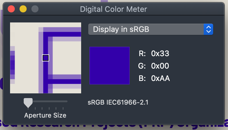
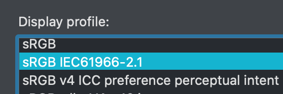
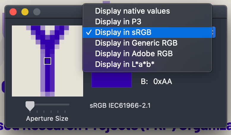
Setup for a Digital Color Meter (Eye Dropper)
In order for a digital color meter or eye dropper tool to provide useful color data, the system color profile and the tool need to be configured correctly. This tutorial is using the standard digital color meter app in MacOS.
The test system should use an sRGB monitor.
- Set the system color profile to a standard sRGB profile when using the digital color meter.
- Set the digital color meter to measure sRGB from the pop up menu.
- Under the view menu, set the digital color meter to report the color values as decimal, hex, or percentage, per your working preference, or the needs of the other tools in use.
- Set the size of the sample to one pixel.
Resources
ON THIS TAB
EMPIRICAL BASIS FOR THE GUIDELINES (IN PART):
Recited from the research of Lovie-Kitchin et alia.
| Reading rate (wpm) | Minimum acuity reserve |
|---|---|
| Spot (∼40 wpm) | 1.3:1 (0.1 log unit or 1 line*) |
| Fluent (≥100 wpm) | 2:1 (0.3 log units or 3 lines*) |
| Maximum | 3:1 to 8:1 (0.5 to 0.9 log units or 5–9 lines*) |
ARC body-text standards are based on the maximum rate with maximum contrast reserve, partly because it is assumed that body text is something that should be read at best fluent rate but also because body text is the most challenging because it is such a high spatial frequency—see the chart below.
Contrast Sensitivity vs Spatial Frequency
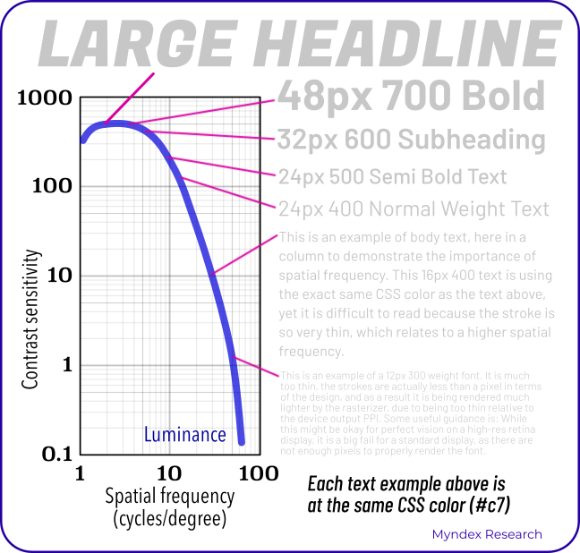
This chart shows the human contrast sensitivity curve, a horseshoe shaped curve where as items get smaller and thinner, contrast sensitivity very sharply drops off. This is particularly important for text.
This chart is adorned with sample text at various sizes, and all of the sample text is exactly the same gray color, but only the larger text is readable, while the smaller text is practically invisible.
The implication here is that it is the spatial frequency, in other words the size and weight of the text, that is most important, more so than the color. Contrast perception is much more about spatial than color at these higher spatial frequencies.
APCA Resources
- "Why APCA?". A plain language introduction to readability contrast.
- Accessible Perceptual Contrast Algorithm (APCA) Visual Contrast Calculator. Takes a pair of CSS sRGB colors and predicts the perceived contrast, suggests a minimum font size and weight for those colors.
- APCA on GitHub. The main repository for the source code and documentation for the APCA contrast method.
External Resources
- Color Vision Deficiency Simulator. Allows designers to preview how their designs may look like to individuals with color blindness. Includes an sRGB grayscale example, useful for visually assessing luminance contrast.
- Web Accessibility: Understanding Colors and Luminance Introduction to Color and Accessibility, a tutorial.
- Mac Color Meters & Color Space Conversion Regarding Digital Color Meters, i.e. "eye dropper tools" on Mac OS X.
- Please Stop Using Grey Text Myths regarding too much contrast are both overstated and misguided.
- Contrast Clearinghouse A catalog of white papers, reviews, articles, and technical information relating to color, contrast, and the APCA.
W3C Resources
- CSS Color Module Level 4 CSS color information, includes information regarding color spaces other than sRGB.
- sRGB Colors CSS specifications regarding the standard sRGB color space.
- Simple alpha compositing W3 CSS guidance regarding calculating colors involving alpha channels.
- Visual Contrast White Paper (In-Progress Draft) An overview of readability contrast, with infographics and a bibliography of the relevant peer reviewed science.
APCA Equation
This equation takes two sRGB color values, one for text and one for the background, and generates a perceptual lightness contrast value (Lc).
It is presented here as an svg image, in MathML, and with the original LaTeX code as the alt-text.
![{\displaystyle {\begin{aligned}\\\ \ \mathbf {APCA} \mathbf {\bullet W3} \ \ &\mathbf {\scriptstyle version\ {0.1.7}\ {developed\ for\ WCAG\ 3\ contrast\ guidelines}} \\[0.66ex]{\scriptstyle Using:}\quad \quad \quad \quad &\\\ \ {APCA}\ Contr&ast\ {Prediction\ Equation\ \ 0.0.98G-4g-base}\\\\Result:\ &{\begin{bmatrix}\hline {\scriptstyle Lightness\ Contrast}\\\quad L\!^{c}=\ S_{apc}\ {\boldsymbol {\times }}\ 100\quad \\\hline \end{bmatrix}}\\\\\textstyle Where:\quad &\\\hline {\scriptstyle Clamp\ Mi}&{\scriptstyle nimum\ Contrast\ Then\ Offset}\\[1.25ex]S_{apc}=&{\begin{cases}0.0\ \ &\vert C\vert <P_{out}\\C-W_{offset}\ \ &\ C\ >0\\C+W_{offset}\ \ &\ C\ <0\\\end{cases}}\\\hline {\scriptstyle Clamp\ No}&{\scriptstyle ise\ Then\ Scale}\\[1.25ex]C=&{\begin{cases}0.0\ \ &{\bigg \vert }Y_{bg}-Y_{txt}{\bigg \vert }<P_{in}\\S_{norm}\times R_{scale}\ \ &\ Y_{txt}<Y_{bg}\\S_{rev}\times R_{scale}\ \ &\ Y_{txt}>Y_{bg}\\\end{cases}}\\\hline {\textstyle Find\ }&{\textstyle Perceptual\ Lightness\ Difference}\\[0.75ex]&{\scriptstyle Normal\ Polarity\ (dark\ text/light\ bg)}\\S_{norm}=&\ Y_{bg}^{0.56}-Y_{txt}^{0.57}\quad \ _{Normal:\ Y_{bg}\ >\ Y_{txt}}\\[0.75ex]&{\scriptstyle Reverse\ Polarity\ (light\ text/dark\ bg)}\\S_{rev}=&\ Y_{bg}^{0.65}-Y_{txt}^{0.62}\quad \ _{Reverse:\ Y_{bg}\ <\ Y_{txt}}\\\hline {\scriptstyle Soft\ Clam}&{\scriptstyle p\ Black\ Levels}\\[1.25ex]Y_{txt}=&\ f_{clamp}(Y)\quad _{color\ of\ the\ text,\ symbol,\ or\ object.}^{where\ Y\ is\ derived\ from\ the}\\[1.1ex]Y_{bg}=&\ f_{clamp}(Y)\quad _{color\ used\ for\ the\ background.}^{where\ Y\ is\ derived\ from\ the}\\[0.66ex]f_{clamp}(Y_{c})=&{\begin{cases}Y_{c}\ \ &Y_{c}>=B_{thrsh}\\Y_{c}+{\big (}B_{thrsh}-Y_{c}{\big )}^{Bexp}&Y_{c}<B_{thrsh}\\\end{cases}}\\\hline {\scriptstyle Constants}&{\scriptstyle \ for\ Clamps\ and\ Scalers}\\[1.25ex]&{\begin{aligned}B_{exp}=&\ 1.414&R_{scale}=&\ 1.14\\B_{thresh}=&\ 0.022&W_{offset}=&\ 0.027\\P_{in}=&\ 0.0005&P_{out}=&\ 0.1\\\end{aligned}}\\\hline {\scriptstyle Estimate\ }&{\scriptstyle Screen\ Luminance}\\[1.25ex]\definecolor {DarkGreen}{rgb}{0,0.35,0}\definecolor {DarkRed}{rgb}{0.6,0,0}Y_s=\textstyle \sum &{\begin{cases}{\color {DarkRed}(\mathbf {R} ^{\prime }\div 255.0)^{2.4}\times 0.2126729}\\{\color {DarkGreen}(\mathbf {G} ^{\prime }\div 255.0)^{2.4}\times 0.7151522}\\{\color {Blue}(\mathbf {B} ^{\prime }\div 255.0)^{2.4}\times 0.0721750}\\\end{cases}}\\[1.25ex]{\{\color {DarkRed}R^{\prime },\color {DarkGreen}G^{\prime },\color {Blue}B^{\prime }\}}&\ {\in }\ \mathbf {s} RGB\\\hline \\\ GitHubRepo&\Rrightarrow \mathrm {https:\!//apcaw3.myndex.com} \\[0.75ex]\\\end{aligned}}}](./img/APCAw3_0.1.17_APCA0.0.98G.svg)
Selected Bibliography
Reading with low vision:
the impact of research on clinical management (2011)
Jan Lovie–Kitchin PhD
School of Optometry Queensland University of Technology
doi.org/10.1111/j.1444-0938.2010.00565.x
Luminance Contrast
Using Color In Information Display Graphics
Larry Arend, with contributions from Alex Logan and Galina Havin
NASA Website, NASA Ames Research Center, Human Systems Integration Division
https://colorusage.arc.nasa.gov/luminance_cont.php
Human factors design standard (HFDS) (2003)
Federal Aviation Administration (FAA)
HF-STD-001. Available for download at
An Engineering Model for Color Difference as a Function of Size
M.Stone, D.Szafir, and V.Setlur
Tableau Software, 2014CIC_48_Stone_v3
Comparing the Shape of Contrast Sensitivity Functions for Normal and Low Vision
S.Chung and G.Legge
Vis Sci. 2016 Jan; 57(1): 198–207.
oi: 10.1167/iovs.15-18084 PMCID: PMC4727522
Psychophysics of Reading (I, II, V, VI, XV, XVIII, XX )
G.Legge, D.Pelli, G.Rubin et alia
Vision Research, Vol. 25, No. 2, pp. 23-9252, 1985.
Vision Research, Vol. 27, No. 7, pp. 1165-1177, 1987
Vision Research, Vol. 29, No. 1, pp. 79-91, 1989
Investigative Ophthalmology and Visual Science,, Vol. 37, No. 8, pp. 1492-1501, 1996.
Vision Research, Vol. 38, No. 19, pp. 2949-2962, 1998.
Vision Research, Vol. 41, pp. 725-743, 2001.
Color Appearance Models
M.D. Fairchild
John Wiley and Sons, 3rd edition, 2013
Realities and Myths of Contrast and Color
A.M.Somers
Colorimetry: Understanding the CIE System
Janos Schanda, CIE
John Wiley & Sons, Inc. 2007
Does print size matter for reading?
A review of findings from vision science and typography
G.Legge, C.Bigelow
Journal of Vision (2011) 11(5):8, 1–22
Model for the spatialcontrastsensitivity of the eye
P. Barten
SPIE Optical Engineering Press 1999
Computerized simulation of color appearance for dichromats
H.Brettel, F.Viénot, J.Mollon
0740-3232/97/1002647-09 1997 Optical Society of America